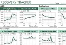
 Looking at the trends in the annual rate of change (ROC) of business and economic measures is an excellent way to reveal hidden information about performance.
When you do so, however, you need to keep in mind that when a measure moves sharply in one direction in a month, your ROC will move sharply in the other direction one year later. And the larger the first change was, the larger the second change will tend to be.
And that brings up a challenge. How do you properly interpret that secondary result?
Today’s report by the U.S. Bureau of Labor Statistics about a sudden rise in US inflation offers a great case in point. Today, the report generated headlines like these:
- U.S. inflation soars in April to 13-year high – MarketWatch.com
- Consumer Prices Jumped in April, Climbing Faster Than Expected – NY Times
- US inflation sees biggest jump since 2008 – BBC News
- Inflation Surge Tees Up Political Peril for Biden Spending Plans – Bloomberg.com
Although US inflation DID increase significantly in April 2021—compared to April 2020—inflation wasn’t as bad as those headlines indicated. And in the next few months, as we compare current prices to the Covid-recovery months, the underlying rate of inflation could be worse than future headlines will suggest.
These Excel figures illustrate the issue:

(Here, the gray columns show the Covid recession and the pink columns show the periods of a US presidential transition.)
One year ago, in April 2020, we were at the deepest point of the Covid recession. As you can see in the figure, the growth rate of these key price indexes dropped sharply. But now, one year later, many prices have returned to normal, and then some. And therefore, we’re getting a sharp movement in the other direction.
(The two charts for March surely will spike even higher when the BEA releases their data for April 2021.)

Similarly, this Excel table shows the ten consumer products that rose most quickly in April 2021, when compared to April 2020.
You can see that gasoline was the “winner” in this competition, with an increase in its price index of 49.6%.
The Federal Reserve Board’s target inflation rate currently is 2%, but this table shows rates of inflation that are 6 to 25 times that inflation rate!
Again, like the charts above, these measures of inflation show the percentage increases in the price indexes from the bottom of the Covid recession in April 2020. So they’re obviously distorted.
What’s the solution? How can we create a measure of inflation that’s truly representative of what’s happening in the economy? Or a measure of growth that’s representative of what’s happening in our company?
One Solution for Measures of Inflation and Growth
There probably are several more sophisticated ways to answer that question. But one easy way to do so would be to ignore 2020 and calculate the Compound Average Growth Rate (CAGR) since 2019.
To illustrate the method, suppose an item had a price of $10.00 in April 2019, and then its price fell to $8.00 during the 2020 recession. Then, suppose the price jumped to $12.00 in April 2021. By most measures, this scenario would generate a rate of inflation for 2021 of:
$12 / $8 – 1 = 50%
But over the past two years, the price has risen by a total of “only” 20%. And that gives us an average rate of inflation for those two years of:
($12/$10)^(1/2) -1 = 9.5%
So if we look again at the previous Excel chart figure, and compare its one-year rate of inflation…

…to this chart that’s average over two years…

…you’ll see significant—and more realistic—declines in the rates of inflation.
- The Consumer Price Index drops from 4.2% to 2.2%,
- The Personal Consumption Expenditures Price Index drops from 2.3% to 1.8%, and,
- The Producer Price Index, All Commodities Index drops from 12.0% to 3.8%.
And when we compare the highest measures of inflation for the one-year and two-year calculation methods, we see significantly different results:

What’s the “correct” solution to reporting recovery from spikes in performance? I’m not sure there is one. But when you’re reporting ROC calculations in your management reports, and the prior year’s performance was uniquely skewed, consider using a two-year average rate of change (ROC) to bridge across that unique period. By doing so, you could help to interpret recent performance more accurately.


