How Fast Is Too Fast?
(Originally published in Inc Magazine.)
What typically tops the list of worries of the chief executive officers of fast growing companies? Financing that growth, according...
How to Smooth Data by Using the TREND Function
Years ago, I read that Prof. William S. Cleveland had suggested that data could be smoothed by calculating a centered trendline through adjacent data—a...
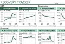
Consumer Sentiment Suggests a 2022 Recession
In recent months, business websites have speculated about recessions and stagflation in 2022.
These predictions could affect your Excel work significantly in the next few...
Simple Transformations Can Reveal Hidden Patterns in Your Data
Excel users have at least two significant advantages over business professionals who rely on other analytical and reporting tools.
First advantage: We Excel users can...
Here’s How Inflation Could Affect the Value of Your Home
November 5, 2021
Inflation is rising in the U.S. And that made me wonder how a higher rate of inflation could affect the price of...
An Excel Chart of a Major U.S. Supply Chain Problem
October 23, 2021
A shortage of truckers now appears to be the greatest problem with the United States' supply chain.
In fact, President Biden said in...
How to Smooth Monthly Trends with Centered Moving Averages
I recently read an article in the Wall Street Journal about the expected increase of electric vehicles in the US. That made me wonder...
How to Foot and Cross-Foot Excel Reports in a Floating-Point World
At first glance, the following report is an ordinary one. It merely sums an Excel Table by Product and Region, and then foots and...
Inflation Tracker Excel Dashboard with Consumer Prices
U.S. President John F. Kennedy once said of a growing economy, "A rising tide lifts all boats."
However, a rising inflationary tide does not lift...
How to Calculate Inflation in Three Different Ways
Today, in the third quarter of 2021, the business press is churning out an avalanche of articles about the return of inflation. Although some...


