How to Smooth Data by Using the TREND Function
Years ago, I read that Prof. William S. Cleveland had suggested that data could be smoothed by calculating a centered trendline through adjacent data—a...
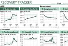
Consumer Sentiment Suggests a 2022 Recession
In recent months, business websites have speculated about recessions and stagflation in 2022.
These predictions could affect your Excel work significantly in the next few...
Simple Transformations Can Reveal Hidden Patterns in Your Data
Excel users have at least two significant advantages over business professionals who rely on other analytical and reporting tools.
First advantage: We Excel users can...
An Excel Chart of a Major U.S. Supply Chain Problem
October 23, 2021
A shortage of truckers now appears to be the greatest problem with the United States' supply chain.
In fact, President Biden said in...
How to Smooth Monthly Trends with Centered Moving Averages
I recently read an article in the Wall Street Journal about the expected increase of electric vehicles in the US. That made me wonder...
How to Foot and Cross-Foot Excel Reports in a Floating-Point World
At first glance, the following report is an ordinary one. It merely sums an Excel Table by Product and Region, and then foots and...
How I Set Up SEARCH and FIND Formulas on Steroids
I've used Excel long enough to recognize when I've stumbled across an unusual formula. And it happened again a few minutes ago.
In the past,...
Eight Great Tools for Your Quick Access Toolbar
I use eight great tools in my Quick Action Toolbar (QAT), and you might want to consider using them yourself.
Before I get into the...
How to Set Up Multiple Conditional Formats with Formulas
In How to Set Up a Square-Format U.S. Map in Excel, I showed how to create a square-format US map in Excel. I also...
How Excel Manages Conflicting Conditional Formats with Formulas
When we're working with conditional formatting with formulas, how does Excel manage conditional formatting rules that conflict with each other?
And how does the "Stop...


