


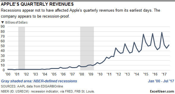
 What insights can you gain from the following Excel chart of Apple’s quarterly revenues over the past 18 years?
I see three things. First, their revenues appeared not to have suffered at all during each of the two recessions shown. As the caption says, Apple’s revenues appear to be recession-proof.
Second, after the iPhone was introduced in 2007, their revenue started to grow, particularly after the recession ended.
Third, starting about 2012, Apple’s revenues became much more seasonal. This was when iPhones first became more than half of their business.
However, there’s a lot more to learn from Apple’s revenue data.
 First, think about those two periods of recession shown in the chart.
Whenever we talk about recessions in the US, or when we see them displayed in charts like the one above, we’re usually talking about recessions as defined by the National Bureau of Economic Research (NBER).
As you can see from the gray areas marked in this chart, we have few recessions like that in the US. In fact, over the past 70 years, the NBER tells us that the US has been in a recession only about 16% of the time.
But the NBER’s definition of recessions isn’t the only one that’s widely used.
The Organisation for Economic Co-operation and Development (OECD) also defines recessions, and their definition is far different from the NBER’s definition. By their definition, as shown by the dark-blue columns above, the US has been in recession much more frequently—about 46% of the time over the past 70 years.
The OECD’s definition is useful for at least two reasons. First, if you ever want to compare US recessions to recessions in other countries, the OECD’s version is the only one I’m aware of that uses the same method to identify recessions in many different countries.
Second, I tend to think of the NBER’s recessions as “real” recessions, and the OECD’s recessions as economic downturns. That definition might not be strictly true, but it’s close and useful—as you can see when we view Apple’s revenues from a completely different perspective.
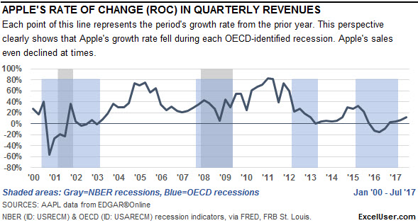
This chart—which I show you how to create in How to Show Recessions in Excel Charts—also shows 18 years of Apple’s revenues in the context of US recessions.
However, this line doesn’t plot Apple’s revenues directly. Instead, it shows the annual Rate of Change (ROC)—the periodic growth rate—for Apple’s revenues.
That is, each point represents the current quarter’s performance divided by the same quarter one year earlier, minus 1. Or, on a monthly basis, you would divide the sum of the most-recent three months of performance by the sum of the same periods one year earlier, and then subtract 1.
Also notice in the ROC line that there’s no hint of seasonality. That’s because you automatically deseasonalize your data when you divide the sum of any three-month period by the sum of the same months one year earlier.
The shading indicates NBER and OECD recessions. The gray shading still indicates NBER recessions and the blue shading indicates OECD recessions. Notice how the OECD recession shading puts Apple’s ROC performance into context…
…In the first blue area, which was a long downturn that included a short NBER-type recession, Apple had two dips in its growth rates. The second dip began just as the NBER-type recession ended.
…In the second blue area, which is about the same period as our (NBER-defined) Great Recession, Apple’s growth rate fell from about 40% to about 10%.
…In the third OECD downturn—which the NBER didn’t define as a recession—the growth rate in Apple’s revenue fell from about 40% to zero.
…And in the fourth OECD downturn, Apple’s growth rate fell from about plus 30% to about minus 15% before starting to recover.
In short, whether you think of them as downturns or recessions, Apple experienced significant economic damage during the OECD-type recessions.
But Apple isn’t the only company—and high-tech isn’t the only business sector—that has suffered during OECD-type recessions.
ROC Analysis in the Consumer Services Sector
This chart of Target’s revenues appears to show that the two NBER-type recessions didn’t phase Target’s revenue at all. However…

…the following ROC chart shows that Target’s biggest two dips in its growth rate were between recessions, and might have been caused by events unique to Target.
The chart below also shows smaller dips in growth rates during each recession. Also notice that Target’s largest annual growth rate during the past ten years was only about 5%, a poor performance that’s reflected in their flat sales shown in the chart above.
However, since the middle of 2015, Target has improved its growth rate every quarter. We’ll see how it goes from here.

Finally, let’s look at another sector, as represented by Caterpillar.
ROC Analysis in the Capital Goods Sector
Here, you can see that Cat’s revenues fell sharply during the Great Recession, rose sharply, and has been falling slowly since about 2012…until recently.

The ROC chart shows more. First it highlights Cat’s spurt in growth in 2004, which the chart above doesn’t show at all.
Second, it shows that Cat was affected early by whatever caused the OECD-type recession in 2012. Also, in 2015, Cat’s growth declined for a quarter or two before that recession hit.
And finally, this chart shows that Cat’s rate of change in revenues has been improving steadily since the beginning of 2016.

The bottom line is that you really should chart your own company’s measures from an ROC perspective, and recession data can help you put that performance into a broader context. By taking this approach, you might identify early-warning signals that you won’t even see by merely charting the raw data.
In How to Show Recessions in Excel Charts, I show you how to download the recession data and plot your own standard and ROC charts that use the data.


