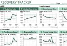
 The figure below shows the first Excel dashboard to display data about a public company. Although this report looks quite similar to today’s reports, the old and the new reports are significantly different under the hood.
Back in 1992 I probably was using Excel 4.0. In those early versions, Excel could support only a few charts in a workbook. So to create this report back then I wrote a macro that generated each chart in a separate workbook and copied its image to the report page.
Today, of course, Excel dashboards are more powerful and much easier to use. Even so, the lesson from those early days still applies to dashboards today: Creating Excel dashboards consists of two areas of knowledge, the body and the data plumbing. The body can look great, but the report will fail if the plumbing is poorly designed.
Since the early 1990s I’ve experimented with many ways to support Excel dashboard reporting. Today, the reason you can generate your first dashboard report in a few hours is that the state of the are has improved so much. And no macros are needed!


