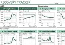
 When I saw a chart designed like the ones below in the Wall Street Journal, I knew I had to create one just like it. But in Excel, we need dynamic chart legends!
What’s A Dynamic Chart Legend?
Dynamic chart legends change as your data changes.
For example, the legend in each of the two charts below automatically adjusts so that the information about the top line also is at the top of the legend bar, and the information about the bottom line is at the bottom of the bar, and so on.
Also, this legend includes the current value for each data series. You can add any other data you want, of course.

Because this chart shows random data, the legends automatically adjust each time I recalculate my workbook.
The Key: Conditional Formatting
I can think of two ways to set up a legend like this.
One way would be to use a Camera object. If it weren’t for one problem, I probably would have used this approach. The problem is that using more than a few Camera objects slows calculation time considerably. Therefore, it’s always a good idea to limit your use of Camera objects to only when you really need them.
The other way is to use Conditional Formatting. This method calculates quickly and produces great results.
Getting Started
There’s nothing special about the data. It’s just a display that shows 13 months for five different categories. Here, of course, the categories are product lines:
Row 4 shows the two range names I used. That is, I named the range of products Product, and the range of current values Current.
The chart is on a separate worksheet:

To create the chart, let’s start with the control area.
Set Up the Legend Controls
I discuss the key values and formulas below. Unless I say otherwise, copy the last formula in a column down its column as needed.
L3: 1
Column L just contains the numbers 1 through 5.
M3: =INDEX(Current,$L3)+ROW()*0.0001
Column M returns data for the current month from the data worksheet…with one addition. We’re going to use the RANK function to rank these results from 1 to 5. However, the RANK function returns duplicate results whenever it ranks duplicate values. To make sure that no two values are duplicates, we add a unique-but-inconsequential value to each value we rank. (Here, we’re adding the row number multiplied by .0001.)
N3: =RANK(M3,$M$3:$M$7)
The formulas in column N rank the results found in column M.
O3: 1
O4: =O3
O5: =O3+1
Column O returns 1,1, 2, 2, and so on. Copy cell O5 down the column as needed to generate these values.
P3: =MATCH(O3,$N$3:$N$7,0)
Formulas in column P automatically sort the results. Cell P3 returns the row number for the highest-ranked result. Cell P4 returns the row number for the second-ranked result, and so on.
Finally, you can set up the formulas that return the labels and values:
I3: =INDEX(Product,$P3)
I4: =INDEX(Current,$P4)
Copy this pair of formulas down the column as needed.
Now that the formulas and values are in place, we can set up our conditional formats.
Set Up Conditional Formats
Select the range H3 through H12. Then, with cell H3 active in New Excel (Excel 2007 or above), choose Home, Styles, Conditional Formatting, New Rule, Use a Formula to Determine Which Cells to Format. Enter the formula shown here:

Then choose the Format button and choose a theme color you want for the Series 1 line. Repeat this process four more times so that the five formulas look like this:
=$P3=1
=$P3=2
=$P3=3
=$P3=4
=$P3=5
For each value, choose a different theme color. After you do so, your spreadsheet should display ten cells with five fill colors, as shown in the chart figure above.
To visually divide each group of colored cells, assign a medium-thick white border around each group of two cells.
Complete Your Report
Using standard charting techniques, create the line chart. Select SERIES 1 and change the color of the line to the color you assigned to the first conditional format. Change the SERIES 2 line color to the second color and so on. Then format the chart area as you want.


