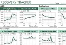
 Because managers need QUICK insight, we should remove as many speed bumps as possible from our reports and analyses.
The following figure with two Excel charts illustrates the problem.
In the Claims chart, up is bad and down is good. This because the chart shows initial unemployment claims and a healthy economy has few such claims.
And in the Weekly Economic Index chart, up is good and down is bad. This is because the WEI shows an estimate of the current year-over-year growth rate of the US economy.
Showing measures with mixed signals like that makes it difficult for managers to scan our reports and dashboards to quickly recognize indicators of good or bad news.

Instead, they must pause at each chart, think about the measure, and then decide whether the trend is headed in the right direction. And if the measure is new, like the WEI, they might not even know whether up is good or bad.
Here’s one way to avoid this speed bump…
Notice the horizontal bright-orange lines on the zero axis in each chart. That’s not the color of the horizontal axis line, it’s an XY line I’ve plotted. By convention, it’s good news when the trend leads towards the bright line. And it’s bad news when the line heads away from the line.
That is, we want all trends to “head toward the bright.”
Give this convention a try in your own charts. To do so, use an XY plot on the secondary axis, scaled from zero to one.
Finally, you might be interested in the version I created several weeks earlier:

In this version, I changed the “bright line’s” Line, Compound Type in the Format Data Series pane. But I think I prefer the Good Signals version.


