


 I showed you the following figures in Chart Your Rate of Change to Reveal Hidden Business Performance.
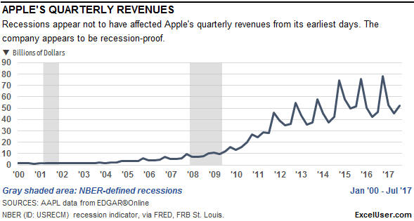
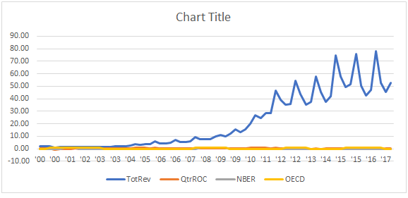
The line in the first chart below shows Apple’s actual quarterly revenues over nearly 18 years. The gray areas show US recessions during that time. With the exception of the two shaded areas, this is an ordinary Excel chart.
On the other hand…
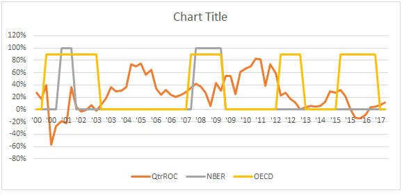
…unless you’ve read Chart Your Rate of Change to Reveal Hidden Business Performance, I doubt that you’ve seen a chart like the following one before.
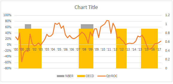
As this figure’s caption explains, the chart doesn’t show Apple’s revenue; it shows the annual rate of change (ROC) of Apple’s revenue at each point in time. By plotting the ROC of any time series data, we can see trends that a simple chart of the raw data never will reveal. For example…
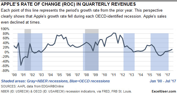
…comparing Apple’s growth rate in sales with two measures of recessions helps us to see how the growth rate of Apple’s sales has been affected by economic downturns. In fact, you can see that during the past 18 years, Apple’s sales actually declined—that is, they had a negative growth rate—during two of the four downturns shown.
You’ll find this technique useful when you display measures of your own company’s performance.
The two gray-shaded areas in both charts show periods of recession as defined by the National Bureau of Economic Research (NBER), which is the standard way that we define recessions in the US. The NBER recession data is available for days, months, and quarters.
The four blue-shaded areas in the second chart show periods of recession as defined by the Organisation for Economic Co-operation and Development (OECD). However, the OECD’s measure of “recession” actually tends to identify economic downturns that the NBER’s measure ignores. The OECD data is available only for days and months.
To begin this chart, you need the recession data.
Download the Recession Data
The FRED database, maintained by the Federal Reserve Board of St. Louis, contains more than 500,000 data series. You’ll download two of them today.
Click the link to visit FRED’s web page, NBER based Recession Indicators for the United States from the Peak through the Trough, which is for monthly data. If you page down on that page, you’ll see a long note that describes how the NBER determines periods of recession. Click on the blue Download button near the top-right of the page to download an Excel workbook with the data.
Then click on the following link to vist FRED’s web page, OECD based Recession Indicators for the United States from the Peak through the Trough, which also is for monthly data. (To find pages with recession data for other countries, go here, and in the left panel, to the right of Geographies, click on View All.)
Follow the same method to download the Excel workbook with that data. The web page also has a long note that describes how the OECD identifies recessions.
When you look at the data, you’ll see that it consists of a column of monthly dates, and a column with only ones or zeros. The ones indicate a month that was in recession.
Arrange Your Data In a Table
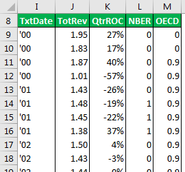 Here’s the table I set up to contain the data for Apple’s charts. Although this is quarterly data, you’ll probably display monthly data in your own table.
I gave the title areas a green fill to indicate that a chart refers to their data. I use green because I found it easy to remember that “green” means “graph.”
The first formula in column I is:
I9: =TEXT($E9,”‘yy”)
Because column E contains date serial numbers, this formula returns the year values shown in the table. When you see the chart at the bottom of this page, you’ll see why I set it up this way.
Notice in the table that the OECD data contains the value 0.9, not 1. By replacing 1 with a number slightly less than 1, I could leave the small gap you see above the four blue areas in the chart above.
How to Create the Chart That Shows Recessions
To set up the shaded areas for both charts, you display the recession data as column plots. I’ll explain how to create the version with two sets of recession data, because you can use similar methods to create a chart with only one set, if that’s what you prefer to do.
Chreat the Initial Chart
To get started, select the range I8 through the last cell of data in column M. Then insert a line chart, which should look something like this:
The blue line shows the quarterly revenue, which we won’t need for this chart, so just select that line and delete it.
Your chart now should look something like this:
Set Up the Column Plots
Let’s set up the two recession lines as Clustered Columns.
To do so, click on the edge of the chart to select it. Then in Chart Tools, Design, click on Change Chart Type. In the dialog, choose Combo, which is at the bottom of the list of chart types displayed on the left side of the dialog…the bottom of which you see here:
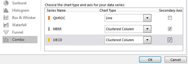
Then set up the three series as shown in the main section of this figure. That is, assign NBER and OECD to the Secondary Axis, and set them up as Clustered Column plots. And set up QtrROC as a line plot.
You now should have a really ugly chart that looks something like this:
To finish the column plots, we need to format them. So click on any of the vertical lines, which actually are skinny columns. Press Ctrl + 1, if necessary, to display the Format Data Seriespane.
In the Series Options tab, set the Series Overlap setting to 100% and the Gap Width to zero percent.
You now should have a chart that looks something like this:
Adjust the Axes
Let’s move the horizontal axes to the bottom of the chart. To do so, click on the horizontal axis, which should display the Format Axis pane.
In the Axis Options tab, click on Labels to expand the area and show you the settings in the Labels group. In the Label Position dropdown list box, choose Low.
Also in the Labels group, click on Specify Interval Unit, and then enter a value of 4. Because this is quarterly data, and because the TextDate column repeats the year for each quarter, this setting will display the year once for every year in the chart.
Near the bottom of the Axis Options group in the Axis Options tab, set the Axis position to be On tick marks.
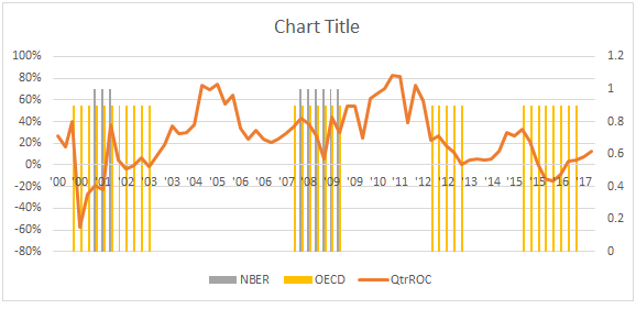
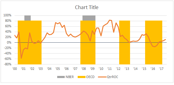
Click on the paintcan icon to display settings for the Fill & Line groups. In the Line group, choose Solid Line. And then assign the Blue-Gray Text 2 color. By doing so, you create the line shown below for zero percentage.
Now click on the vertical axis on the right side of the chart. In the Format Axis pane, click on the Axis Options tab. In the Axis Options group…
- Replace the Minimum setting of 0.0 with 0, and,
- Replace the Maximum setting of 1.2 with 1.
When you do so, Excel will display 0.0 and 1.0 respectively. This is fine, because by making those changes, you’ve set the secondary vertical axis always to go from zero to one.
With the right axis still selected, in the Axis Options tab, click on Labels to display the Label Position dropdown list box, and then choose None, which will hide the axis labels on the right.
Your chart now should look something like this:
Adjust the Colors
 Click on any of the four orange columns, which should display the Format Data Series pane.
(If the title of the pane is Format Data Point, press Ctrl + Down Arrow then Ctrl + Up Arrow to move your selection to the actual series, rather than to one of its data points.)
In the Fill & Line tab, in the Border group, choose No line.
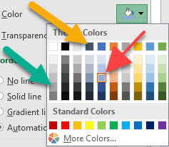
In the Fill group, choose Solid fill. In the Colordropdown palette, choose Blue Accent 1, Lighter 40%, where the red arrow points in the figure above.
Then set the transparency for this color to 50%.
Follow the same procedure for the gray columns, setting them to White Background 1 Darker 35%, where the green arrow points in the figure above.
Set its transparency to 50%, as well.
Now select the line. Set it to Solid line and set its color to Blue-Gray Text 2, where the orange arrow points in the figure.
Your chart now should look like this:
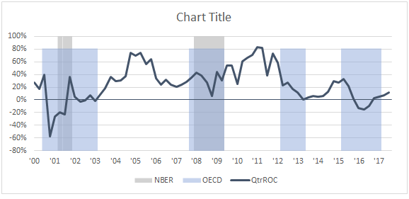
Finally, if you want your chart figure to look something like my original figure, select and delete the Chart Title and the Legend. Then, in the Format Chart Area pane, set the Fill to No fill and the Border to No line.
Then, when you add and format the text that surrounds your chart, your final version should look something like this:


