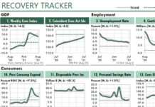
 In Weekly & Monthly Top-Ten Activity Reports I introduced two Excel dashboard reports created by Chris Helfrecht. In this post, I’ll describe a critical aspect of his report workbook: the workbook structure.
All Excel reports perform at least four tasks. Good reports assign these tasks to four sections, with specific worksheets defining each section.
The sections are:
- Data–the external or manually entered data. Typically, the data consists of one or more tables that can be updated easily.
- Staging–where the data is arranged for presentation and where most of the calculations happen.
- Presentation–what the audience sees.
- Control–where the author controls report dates and other workbook-wide settings and calculations.
For most reports, it’s important to keep these sections in separate worksheets. Doing so makes your reports easier to create, update, error-check, modify, and automate. This is what Chris’s workbook does.
Other than using a worksheet named Control, I’ve never seen these sections formally labeled. But the worksheets for each section typically are adjacent and easy to identify.
The Data section of Chris’s report consists of four worksheets that use external data tables connected to an Oracle database.
His Processing section includes two worksheets that use the INDEX function to return data for certain dates from the Data section. Other formulas calculate the results he wants to report, and format them for use by charts and the Camera tool.
The Camera tool (also called a Picture Link) probably is Excel’s most-useful-but-least-used feature. It returns a live picture of a designated range. I’ll discuss Chris’s use of the Camera tool in future posts.
Chris’s Report section consists of the two worksheets that contain the dashboard reports shown in my previous post.
Chris’s Control section also consist of two worksheets. These probably could be condensed into one worksheet.
These links provide additional information:


