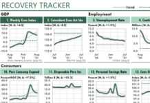
 The Covid recession is the worst recession the world has experienced since the Great Depression. And the Recovery Tracker workbook and Excel training can help you to monitor our recovery after it.
The next few pages will cover two topics that the training covers in detail.
First, I’ll use Excel charts to give you a brief overview of where the US economy was during the first six months of the Covid Recession.
Second, I’ll explain the Excel strategies and tactics I used to create the Recovery Tracker dashboard, and to update it in less than 10 seconds every few days.
As I tell you about these Excel figures, try to think about ways you could use similar methods to report your company’s performance during these challenging times.

Figure 1 displays an index created early in 2020 by three economists at the Federal Reserve Bank of New York. It provides a way to track the US Gross Domestic Product (GDP) weekly, even though the GDP is updated only quarterly.
The Weekly Economic Index relies on 10 weekly economic indicators to estimate the annual growth rate of the US GDP each week.
So, for example, if the green line were to remain at about -6 for the next calendar quarter, we would expect the quarterly value for the GDP to be about 6% lower than the same quarter one year earlier.
You can see that the GDP’s growth rate collapsed to about -12% after Covid-19, and then it started to recover.

Figure 4 shows us that in two short months after the Covid Recession began, the number of people collecting unemployment insurance in the US had jumped by more than 20 million people.
In the chart, the red dotted line shows where the measure was in February 2020, before the Covid recession began. The other dotted line shows the trend in the green line. And the gray shaded area shows the Covid Recession period, which began in March 2020.
In the subtitle, the “W” tells us the chart’s data updates weekly, and the delta number is the difference between the red dotted line and the current value. To illustrate, in August 2020 the US had about 13.5 million more people getting unemployment insurance than when the Covid Recession began.
And the bottom note provides the source of the data—the US Employment & Training Administration (ETA)—and the last date on which the data was updated. If a month has passed since that date, or if seven days have passed for weekly charts, more data likely is available for update.

Figure 8—both of them—give us the Industrial Production Index, which measures real output for US mining and manufacturing companies, and for electric and gas utilities.
The version on the left shows the actual Index. As you can see, however, Excel’s default settings for the Y axis values cram all the useful data into the very top of the chart. This makes the fall and rise of the Index appear to be insignificant.
Therefore, I set up the Recovery Tracker to easily display the annual rate of change (ROC) of any measure. So in the right figure, with ROC in its subtitle, you can see the significant changes that our Industrial Production Index actually had experienced in Covid’s first five months.
Here’s how to interpret the ROC version: By April, the Index had fallen about 16% below its value one year earlier. And then it started to improve. By July, it was still more than 8% below its value one year earlier, and 7.9% below its February value. But that was a significant improvement from its April number.

Figures 17 and 18 show the extreme changes that the Covid Recession has brought to the retail industry.
Figure 17 shows us that revenues for Nonstore Retailers—mostly online stores—increased by nearly 30% above their level one year earlier.
And then, as the economy started to improve, their revenues actually started to fall somewhat.
In contrast, Figure 18 shows what we already knew—that Food Services and Bars were hit hard by Covid. Their revenues initially fell by more than 50% of their revenues a year earlier, and then improved significantly by June. But as of July, the improvement had stalled.
The full Revenue Tracker workbook tracks 27 different measures, as you can see here:

The tracker tracks measures about consumers, construction, employment, wholesale, freight, world trade, and other aspects of the economy.
From an Excel Perspective…
To update this dashboard report, you just open the workbook and press Ctrl + Alt + F5, which causes Power Query to refresh all the data by downloading it from the Federal Reserve Economic Database (FRED). And then, about ten seconds later—depending on the speed of your internet connection—you’ll have an updated Recovery Tracker report…
…If you have Excel 2010 or later, or Excel 365. However, Excel 365 or at least Excel 2016 are strongly encouraged.
Using similar methods, you could refresh your own Excel dashboards and other reports just as easily.
This is possible to do because the Dashboard Tracker uses productive Excel data plumbing, as shown here:


The 25 pages of training cover Excel best practices for creating dashboards like it. And the training also explains each of the 27 measures.
Here are some of the best practices the training covers:
• How to set up your report’s date formula to update automatically and display from a narrow column in your report.
• How to maintain your short titles, units of measure, number formats, and scaling values in an Excel Table so that figures in the report can use them easily.
• How to set up category labels like Wholesale, Employment, Retail, and so on, so that they appear automatically at the start of each new category in the report—as the following figure illustrates.
• How to set up the dates for the charts’ X axes so that your labels wrap to two lines when needed, and they ALWAYS display horizontally.
• How to set up your charts to use the Rate of Change (ROC) calculations, as you can see below in Figures 19 and 22.
• How to set up your conditional formatting, using formulas, so that the fill color for each title alternates by category, like this:

• How and why to set up named constants for special characters in your reports, as you see in the subtitles in the charts above for the delta (Δ) character, which is the common abbreviation for “change.”
• How to work with grouped worksheets so you can save many hours of work when you create reports and analyses.
• How to plot the red dotted line and gray trendline in each chart.
And most important of all, with the complete Recovery Tracker report, you’ll have an example of a well-structured workbook through which data can flow easily from its source to your reports.
This training is unique. Not only does it give you a workbook that allows you to track the US recovery from the Covid pandemic, it teaches you best practices you can use in your own reports and Excel dashboards.
 Until the Covid-19 worldwide economic disaster, I would have priced this unique training at $189. But now, you and your employer probably need all the recovery help you can get.
That’s why I’ve slashed the price of the Recovery Tracker training from $189 to only $87…more than $100 off.
I’m not sure how long I’ll be able to keep this unique training at this low rate. So I urge you to act now.
To start tracking the United States’ economic recovery, and to learn key best practices for Excel reporting and analysis, click this link to get the Excel Recovery Tracker NOW.


