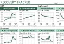
 The following Excel chart shows that Excel really CAN generate professional-quality chart figures.
Here are some general strategies to consider…
1. Set up your data-plumbing correctly. Here, the figure references a Staging Table, which references a Data Table maintained by Power Query, which updates the data from the Web in less than five seconds.

2. Think of chart FIGURES, not charts. Here, the chart object displays only the line plots, axes, and gridlines. Everything else in the figure is on the worksheet.
3. Get your colors right. These are from a book of color indexes. I kept the same hues but changed their luminance, using Excel’s HSL color model in the Colors dialog for Excel 365.
4. Get your number of periods right. My Staging Table has 61 rows. And 61 divided by the label interval of 10 gives me 6 date labels, plus one more.
5. Use shapes. The headline and subtitle on the left are in text boxes, not in cells. By using text boxes, I could position and wrap the text more easily.
6. Use the appropriate unit of measure. Almost always, the price of crude oil is expressed in barrels. But a few seconds on the Internet can tell you that those barrels hold 42 gallons of crude. By charting crude by the gallon, the chart is not only easier to create, it allows us to view the relative prices of gas and Diesel on the one hand and crude on the other.
7. Feel free to create your own legends. Here, the legends are just a narrow column with various fill colors. Not only does that design look professional, it allows you to add more than mere titles with each legend.


