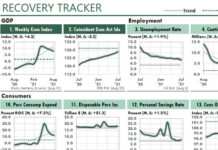
 The workbook that supports the following figure does a lot of work!
First, it uses Power Query to download the weekly unemployment claims and the number of people covered by unemployment insurance, by state, since January 2019.
Then, for each of the most-recent three months, it calculates the total initial claims per month as a ratio of the average number of people covered during the month.
Then it sorts the data automatically. To do so, a column in one table uses RANK.EQ to rank each state by the current-month’s total. (It didn’t matter whether I used RANK, RANK.EQ, or RANK.AVG, because when we sort by formula, we never can have duplicate values to be ranked.)
Finally, a second table uses XLOOKUP to return an ordered list of the five states in the top and the bottom of the rankings. And finally, the formulas in this table use XLOOKUP to return the best and worst values. (INDEX–MATCH Could have done the same thing.)

In this table figure, each column chart has TWO series, not just the one series you see for each state. The hidden series is a line that plots two points: the maximum and minimum values for all data shown. That way, because each chart plots the same max and min values, each chart has the same values in its Y axis.
From a management perspective, internal data tells you what happened. But external data can help to tell you why it happened, what might happen next, and what you might be able to do about it…as this figure suggests.
Specifically, people living in the states on the left side of this figure probably are better able to buy consumer goods than are the people on the right…ceteris paribus.
On the other hand, if you sell red ink…


