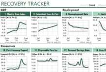
 This is the first dashboard report ever created with spreadsheets. I worked on this reporting technique in the early 1980s, then included this report in my first book, Financial Modeling Using Lotus 1-2-3, published by Sybex McGraw-Hill in 1986.
The report created its graphs with characters. Using Excel terminology, each line of each chart used the REPLACE, REPT, and LEFT functions to generate those characters.
This work was necessary because that was the only way back then to create one report with many small charts. Yes, Lotus did have a rudimentary charting system. But 1-2-3, like Excel in its early days, offered no way to print more than one “real” chart per page.
Today, of course, Excel dashboards are much more powerful and much easier to use than Lotus was.

I called this report a Mini Graph Management Report. Today, we would call it a dashboard report.
The report created its graphs with characters. Using Excel terminology, each line of each chart used the REPLACE, REPT, and LEFT functions to generate those characters.
This work was necessary because that was the only way back then to create one report with many small charts. Yes, Lotus did have a rudimentary charting system. But 1-2-3, like Excel in its early days, offered no way to print more than one “real” chart per page.
Even though this report is more than 30 years old, it contains several elements that I still use in my dashboards today, as this close-up illustrates:

Each figure in the example above begins with a single-character title — here, M, N, and O — to make it easy to refer to a figure during conversation. In meetings, I found it much easier to say, “Look at figure O”, rather than “Look at the number of employees. It’s the third figure from the left in the bottom row.” These days, I tend to use numbers rather than labels, but either method works.
Figure M above uses “Gray” as we would use yellow in a traffic light display today. Back then, “Black” would correspond to red in a traffic light display, and “White” would correspond to green. Today in Excel we can create a similar effect with colored bars in a bar or column chart.
These days, with the growing popularity of dashboards, I’ve occasionally wondered what “firsts” I can claim with regard to spreadsheet dashboard reports.
I’m sure that my Lotus mini-graph reports were the first dashboard reports ever created for spreadsheets. And because there was very little management software available back then, they probably were the first dashboard reports created for personal computers.


