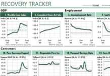
 You can update this Excel dashboard report every weekday—with one command—if you have Excel 2016 or above.
This report of current economic data introduces you to some of the best practices for Excel reporting and analysis, best practices that can slash your Excel errors and reporting times. You could update this report, for example, with one command…using Power Query.
And also, from a reporting perspective…

…this dashboard illustrates a general design that your readers can consume quickly and easily.
The report contains daily and weekly economic data from the Federal Reserve Economic Database (FRED), which is the source of the largest source of free economic data in the country. The fill color of each figure’s title cell indicates the type of data it contains.
• Green: Prices…for energy, precious metals, gasoline, etc., and also daily prices for the NASDAQ, Wilshire Small Cap, and Wilshire Large Cap stock indexes.
• Maroon: Interest rates…for mortgages, treasury bonds and bills, and the Yield Curve.
• Blue: Miscellaneous measures…for stock indexes, Broad FX rate, unemployment, inflation, etc.
 Each chart figure displays key information about the data it displays. For example, here’s the information for Figure 6:
• The Unit of Measure, which is dollars per Troy Ounce.
• The Change During the Period Shown, which shows that gold rose $80.10 per troy ounce during the 31 weekdays of data shown in the chart.
• The Source of Data, which is the ICE Benchmark Administration Ltd.
• The Date of Last Update, which tells us that July 10 was when FRED last updated the price of gold. (In other charts, FRED’s date of update is often several days after the most-recent data for which data exists.)
With the Economic Update workbook and its training PDF…
• You’ll see a productive workbook in action, so you’ll be able to learn ways to make your own Excel reporting and analysis more productive, with fewer errors.
• You’ll be able to track key business and economic trends every morning during the workweek. That will allow you to keep your managers informed about changes that influence your company’s costs, its investments, and the direction the economy is heading.
• You’ll learn more about each of the measures, so you’ll be able to interpret their performance more confidently.
• You’ll learn key strategies for flowing data from your Excel Tables to your reports and analyses, so you can update them in seconds.
• If you don’t use Excel Tables or the SUMIFS function, or even range names, you’ll start to understand the power you’ve been missing. (Every problem workbook my corporate clients have sent me in recent years has had no Tables, no SUMFS functions, and few if any range names!)
• You’ll have working examples of Power Query, which is the best new feature that Microsoft has added to Excel in recent years.
• You’ll learn simple formatting tricks that can turn a report with charts into a professional-looking Excel dashboard.
• And, as one beta tester has confessed to doing, you might even become addicted to your Economic Update report!
Here’s What to Do Next
 Until the Covid-19 worldwide economic disaster, I had priced this unique training package for $139. But now, you and your employer probably need all the recovery help you can get.
That’s why I’ve slashed the price of the Economic Update training from $139 to only $67.
To get started, choose Excel Productivity NOW.
This Excel dashboard report lets you follow key economic trends while showing you how to gain a HUGE increase in your Excel productivity at work.


