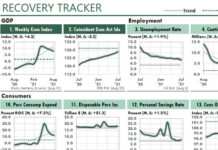
 When one of my readers, Chris Helfrecht, sent the two sample Excel dashboards below, he wrote that he tried to follow my methods for managing his data and presentations. He also wrote that people in his company have been very enthusiastic about his new dashboards.
I recognized a lot of my ideas in his samples. I also found some new ideas. Some of these I like a lot, and some not so much. The articles listed at the bottom of this article explain the details of his dashboard workbook, and suggest ways that I would change it.
For now, take a look at the two examples, and I’ll get into the details in the three other articles.

In case you missed the caption, you can click on either image to see a larger version. Then click your browser’s Back button to return to this page.

These links provide more detailed information:
- Advice about Using Excel’s Camera Tool
- How to Structure Your Report Workbook
- Making Top-Item Charts Easier to Read
About the Excel Dashboard Author
Chris Helfrecht has worked in Finance for about twenty years and as an Oracle Developer for seven years. He built these dashboards when he worked as a Quality Systems Analyst for a large medical device company. He wrote that Excel is a very useful tool for his purposes because users aren’t afraid of it, and it offers excellent reporting features.


