 When you report or analyze performance in Excel, you need to ask yourself a key question…
Am I documenting results, or communicating them?
There’s a huge difference.
When you document, you give your readers mere data. When you communicate, you summarize or filter away the nitty-gritty details, so your readers can see patterns in performance more easily.
That is, you separate the wheat from the chaff.
When I was young, I remember creating reports about data I didn’t understand very well. And I remember thinking, “I’ll just give them the facts and let them decide what’s important.”
That was exactly the wrong approach.
Instead, I should have asked questions. I should have reported patterns and levels of summary that made sense to me…and then asked for feedback. I should have taken the risk of doing it wrong so I could learn better ways to do it right.
I should have found ways for my readers to quickly understand and remember performance.
Here are seven quick ideas to keep in mind when you want your reports to communicate results…
1. Trends Matter. This is why I like charts so much, and why most of my charts are line charts. More than any other type of report, readers can see and remember patterns in line charts.
2. Pennies Don’t Matter. Most reports with pennies merely document; they don’t communicate. In fact, numbers with more than three or four characters provide mere documentation. A number like 13,885,979.23 merely documents; a number like 13.9 million communicates.
3. Contrasts Matter. Contrasts answer the question, “Compared to what?” This is why reports showing actual-vs-budget, actual-vs-forecast, or recent trends are used so widely. In all three cases, these types of reports put current performance into the context of other relevant trends.
4. Patterns Matter. Heavy duty statistics could reveal many patterns. But using many small and simple charts is easier to understand, and often more effective. Small charts allow readers to ask questions like:
- “This measure is trending up while this measure is trending down. Why?”
- “Whenever this measure jumps up, this other measure jumps up several months later. What’s the connection?”
- “This measure crashed while everything else stayed about normal. Are you sure this measure is correct?”
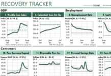
The ability to surface questions like these helps to explain why dashboard reports — with their many small charts and tables — are so popular.
5. Glitz Is Bad. Too many management reports, including Excel reports, look like they were designed at a carnival. They use 3D graphics, loud colors, fancy fonts, expensive gauges, aggressive shading, and other kinds of report-junk to decorate their results.
All of that glitz distracts from the message that your underlying data is trying to send. It makes communication more difficult!
6. Explanations Matter. I know a top-performing CFO who says that his monthly performance narrative is a key management tool. That’s one way to explain performance.
Here’s another way: Turn normal charts into diagnostic charts by adding columns to highlight recessions and other reasons that might explain actual performance.
 For example, this time series chart uses a line to show an economic trend that has a huge effect on retail sales. This chart also shows that trend in the context of recessions in the US and in three other regions.
7. Readability Matters. Excel’s printing tool offers a shrink-to-fit option, which typically prints text so small that it’s illegible to any reader over 40 years old. Never use it. In fact, try never to use a font size less than 9 points.
Also, if you’re old enough to remember blue-bar and green-bar computer paper, you’ll remember how those colors turned to mud when you Xeroxed them. Don’t make the same mistake with modern color output. If you use shading, keep it light so it doesn’t obscure the text on which it’s printed, even after your report is copied with a monochrome copier.


