How to Smooth Data by Using the TREND Function
Years ago, I read that Prof. William S. Cleveland had suggested that data could be smoothed by calculating a centered trendline through adjacent data—a...
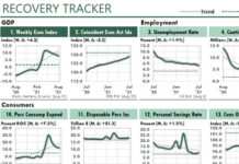
Consumer Sentiment Suggests a 2022 Recession
In recent months, business websites have speculated about recessions and stagflation in 2022.
These predictions could affect your Excel work significantly in the next few...
Simple Transformations Can Reveal Hidden Patterns in Your Data
Excel users have at least two significant advantages over business professionals who rely on other analytical and reporting tools.
First advantage: We Excel users can...
An Excel Chart of a Major U.S. Supply Chain Problem
October 23, 2021
A shortage of truckers now appears to be the greatest problem with the United States' supply chain.
In fact, President Biden said in...
How to Smooth Monthly Trends with Centered Moving Averages
I recently read an article in the Wall Street Journal about the expected increase of electric vehicles in the US. That made me wonder...
Warren Buffett, Inflation, and Excel
On May 3, 2021, CNBC quoted Warren Buffett saying, “We are seeing very substantial inflation. We are raising prices. People are raising prices to...
Add Low-Overwhelm Context to Your Line Charts
The data you display in charts often takes on new meaning when you display it in the context of other data.
One way to add...
Calculate Mortgage Payments and Your ROA with an Excel CalcPlot Chart
An Excel CalcPlot Chart allows you to plot values in three dimensions, not merely two. Here are two examples.
Mortgage Paments
Mortgage interest rates are at...
Chart Recessions and Other Boolean Conditions in Excel
I doubt you’ve seen an Excel chart like this before. It shows multiple Boolean conditions that might affect the trend in the annual Rate...
Show Top and Bottom Results in a Chart-Table
The workbook that supports the following figure does a lot of work!
First, it uses Power Query to download the weekly unemployment claims and the...


