Saturday, September 23, 2023
Excel provides several worksheet functions for working with normal distributions or 'bell-shaped curves.' This introduction to Excel's Normal Distribution functions offers help for the statistically challenged.

An Introduction to Excel’s Normal Distribution Functions

(Download the workbook.) When a visitor asked me how to generate a random number from a Normal distribution she set me to thinking about doing statistics...
Excel's FREQUENCY function was first created to calculate frequency distribution tables, which are needed for charting histograms. But the COUNTIFS function offers more power, and it's easier to use.

Use COUNTIFS, not FREQUENCY, to Calculate Frequency Distribution Tables for Charting Histograms

Because the Texas and California governors have been bickering over the Texan's attempt to poach California employers, I got curious about the distribution of...
The extreme variability caused by seasonal sales makes it difficult to track and forecast your underlying sales trends. Here's how to solve that problem.

How to Create a Rolling Forecast of Seasonal Sales in Excel

The Excel chart below shows the typical saw-tooth pattern of seasonal sales. Seasonal sales have about the same pattern every year, every week, or both. In...
Although Excel's FREQUENCY function was designed to calculate frequency distributions, you also can use the SUM-IF, SUMPRODUCT, INDEX-FREQUENCY, and COUNTIFS functions. Here's a summary of the methods and your options.

Five Ways to Calculate Frequency Distributions in Excel

Walt captures blood-pressure readings and wants to find how often the readings fall into various ranges of values. This is a common need for a...

Find Leading Indicators Using Automated Cross Correlations in Excel, Part 1

It all seems so simple... To improve your forecasts of sales or other measures, you simply need to find leading indicators...measures that are highly correlated...
Using Excel 2007 and above, you can create shaded areas in charts to specify areas of special interest. Here's how to do this using normal curves.

How to Create Normal Curves With Shaded Areas in Excel

Adding shaded areas to normal curves like this is a challenging task in Excel charting. But once you know how, it's not difficult to...

How to Smooth Data by Using the TREND Function

Years ago, I read that Prof. William S. Cleveland had suggested that data could be smoothed by calculating a centered trendline through adjacent data—a...
If you have seasonal sales, or other measures of performance, Cycle Plots can offer more insight into your performance than traditional charting techniques.

How to Create Cycle Plots in Excel to Chart Seasonal Sales Data

If your company's sales are seasonable, you've probably seen a chart that looks something like the first one below. This Excel chart shows the continuous...
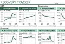
The two Excel dashboard-like charts with May data show that consumer confidence has dropped like a rock since March. But Asia's data isn't available yet.

Dashboard-Like Excel Charts of International Consumer Confidence

The following Excel figure displays its charts in a dashboard-like format. At least, it's in a format that dashboards should use! When you use simple...
When you combine conditional formatting with charts you can create detailed chart legends that match the relative positions of the lines in your chart.

How to Create Dynamic Chart Legends in Excel

When I saw a chart designed like the ones below in the Wall Street Journal, I knew I had to create one just like...

Latest Articles

Growing too fast can be dangerous to your company's health. Use the Sustainable Growth Rate ratio to track your company's financial ability to grow.

How Fast Is Too Fast?

(Originally published in Inc Magazine.) What typically tops the list of worries of the chief executive officers of fast growing companies? Financing that growth, according...

How to Smooth Data by Using the TREND Function

Years ago, I read that Prof. William S. Cleveland had suggested that data could be smoothed by calculating a centered trendline through adjacent data—a...
Two economists have introduced a new leading indicator, which predicts a recession soon. These Excel charts illustrate their insight. If they're correct, Excel users will be very busy in the months ahead.

Consumer Sentiment Suggests a 2022 Recession

In recent months, business websites have speculated about recessions and stagflation in 2022. These predictions could affect your Excel work significantly in the next few...
Advertisement