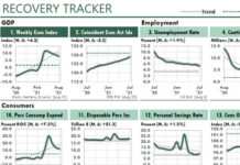
 This mock-up is based on a format that Business Week used about thirty years ago. However, their report used a different color scheme. As I remember, it originally was yellow and red.
This report uses some tricks that Excel has allowed us to do for a long time. For example, did you notice that the columns of the tables don’t line. How is that possible to do?
Notice the little images at the bottom. These days, we’d probably show icons, not little cartoons. What if we wanted to let the data determine which icons to display? How would you set your report sheet to display the icons that formulas requested?

As a general rule, pages filled with columns of numbers tend to put their readers to sleep. But this mock-up, adapted from an old Forbes magazine display, is an exception.
Although this page contains many numbers, the numbers are grouped in categories that interest typical managers: top customers, our company vs the competitors, customer satisfaction, top products, numbers of employees, etc.
Again, notice that many columns of numbers on the left side of this report don’t line up vertically. Do you know how it’s done?
I used Excel’s Camera Tool, which now is called Linked Pictures.


