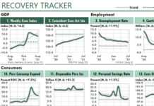
 The Excel dashboard below is from the first-ever package of dashboard reports, which I created to show Excel’s power to a client back then. I based the design on an example I had seen in the Harvard Business Review.
Most of the charts are identical because there wasn’t a need to create many different sets of artificial data.
Lotus 1-2-3 dominated the spreadsheet market at that point, and my client didn’t believe that any software could be as powerful as Lotus.
I called the page a Mini-Graph report because “dashboards” at that time referred only to what drivers and pilots looked at, not managers.
I created this report with Excel 2.0, which was the first version of Excel for Windows. But because Excel 3.0 was introduced in December, 1990, I probably printed this page using that version of Excel.
In the early versions, Excel charting was extremely limited. And we had only “spreadsheets” with one sheet. “Workbooks” that can have many “worksheets” hadn’t been invented then.
So to create this report, I wrote macros (before VBA), which generated each chart in a separate spreadsheet, copied its image to the report spreadsheet, generated the second chart, copied its image, and so on.
This was not a practical way to generate dashboards!


