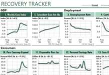
 The following Excel figure shows three indicators of the US economy.
Chart 1 measures the number of new unemployment claims during the past week as a percentage of the civilian labor force. And the labor force is defined as the number of people working plus the number of people unemployed.
Chart 2 shows the annual growth percentage in commercial and industrial loans, for all commercial banks. As you can see, as soon as the economy started to shut down, businesses started to borrow what they could.

Chart 3 shows the percentage growth in the Cass Freight Index for shipments. The index is a measure of the US freight market. Each year, Cass processes about 36 million invoices on behalf of large shippers from many industries.
From an Excel perspective…
Using column charts rather than line charts makes it much easier to compare different periods. But, if I wanted to look only at trends, I would have used line charts.
I used Power Query to return the data from FRED, the Federal Reserve Economic Database.
Because all three figures plot 13 points, I set up each chart to show a label every three periods. And because 3 divided into 13 equals 4 with a remainder of one, the chart shows 4 labels plus 1 more.


