Sunday, September 28, 2025
With a little creativity in the design of your Excel charts, and in choosing its colors and fonts, you really can create professional-quality results.

Professional Quality Excel Chart Labels, Legends, and Colors

The following Excel chart shows that Excel really CAN generate professional-quality chart figures. Here are some general strategies to consider… 1. Set up your data-plumbing correctly....
These Excel column charts of employment, business lending, and freight shipments show mixed signals about the current health of the US economy.

Excel Bar Charts with Economic Indicators

The Excel figure below shows three indicators of the US economy. Two show economic improvements and one doesn't. The Excel Perspective Using column charts rather than...
This figure uses the Chicago Fed's National Financial Conditions Index to illustrate how to create an Excel panel chart.

US National Financial Conditions Using Excel Panel Charts

I’ll explain the meaning of this chart figure shortly. But first, let’s look at it from an Excel perspective. (Note: I’ve begun to use economic...
The Weekly Economic Index (WEI) combines ten weekly measures to estimate the growth in the United States' GDP each week. It's the only measure of its kind.

Chart of the New Economic Index that Tracks GDP Weekly

In April 2020, the Federal Reserve Economic Database (FRED) added a measure that will be followed closely during the Covid-19 economic devastation and recovery....
This Excel figure shows three charts showing Covid-19's economic damage: Initial Claims, Business Loans, and Cass Freight Shipments.

Three Charts Showing Covid-19’s Economic Damage

0
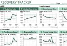
The following Excel figure shows three indicators of the US economy.Chart 1 measures the number of new unemployment claims during the past week as...
You can uncover hidden trends by charting the ratio of each month's performance to the same month one year earlier.

Introducing the Power of Year-Over-Year Performance Charts in Excel

0
The purpose of management reports should be to help readers find and track patterns of performance…quickly and easily. That’s the attraction of charts, of course....
Economic analysts use the Beveridge Curve to analyze the labor market through business cycles. You can use it to analyze how any two measures—internal or external—correspond over time.

Beveridge-Chart Trend Analysis with Excel

0
Here's a great way to discover new insights in your company's data: Always watch for new methods of looking at data...even if you care nothing...
If you're charting only your raw business data, you're missing many opportunities to give your readers useful business insight. Here are three simple tricks that will help you to turn your ordinary charts into analytical ones with much greater insight.

Three Simple Tricks to Improve Analytical Charting in Excel

0
For years, my Excel charts of trends used a simple idea: To gain insights about periodic data, just chart it. What else was there to...
When you include recessions and economic downturns in your charts, you can show your company's performance in a much better context. Here's how to set up your Excel charts to display those recessions and downturns.

How to Show Recessions in Excel Charts

0
I showed you the following figures in Chart Your Rate of Change to Reveal Hidden Business Performance. The line in the first chart below shows Apple's...
By charting the annual Rate Of Change (ROC) of key measures, you can uncover significant information about your time-series data. And by using the right recession measure, you can put that information into better context.

Chart Your Rate of Change to Reveal Hidden Business Performance

0
What insights can you gain from the following Excel chart of Apple's quarterly revenues over the past 18 years? I see three things. First, their...

Latest Articles

Excel Flowbook Revolution

Getting Radical with Excel

It's time to think about Excel in a radical new way—when we use it to work with business or economic data. It's time, in fact,...
Growing too fast can be dangerous to your company's health. Use the Sustainable Growth Rate ratio to track your company's financial ability to grow.

How Fast Is Too Fast?

(Originally published in Inc Magazine.) What typically tops the list of worries of the chief executive officers of fast growing companies? Financing that growth, according...

How to Smooth Data by Using the TREND Function

0
Years ago, I read that Prof. William S. Cleveland had suggested that data could be smoothed by calculating a centered trendline through adjacent data—a...
Advertisement