Monday, September 29, 2025
When you include several charts in one report, your managers must THINK about each chart to decide if it shows good news or bad. Here's a fix for that.

How to Remove a Speed Bump From Your Excel Charts

0
Because managers need QUICK insight, we should remove as many speed bumps as possible from our reports and analyses. The following figure with two Excel...
The two Excel dashboard-like charts with May data show that consumer confidence has dropped like a rock since March. But Asia's data isn't available yet.

Dashboard-Like Excel Charts of International Consumer Confidence

0
The following Excel figure displays its charts in a dashboard-like format. At least, it's in a format that dashboards should use! When you use simple...
With a little creativity in the design of your Excel charts, and in choosing its colors and fonts, you really can create professional-quality results.

Professional Quality Excel Chart Labels, Legends, and Colors

0
The following Excel chart shows that Excel really CAN generate professional-quality chart figures. Here are some general strategies to consider… 1. Set up your data-plumbing correctly....
These Excel column charts of employment, business lending, and freight shipments show mixed signals about the current health of the US economy.

Excel Bar Charts with Economic Indicators

0
The Excel figure below shows three indicators of the US economy. Two show economic improvements and one doesn't. The Excel Perspective Using column charts rather than...
This figure uses the Chicago Fed's National Financial Conditions Index to illustrate how to create an Excel panel chart.

US National Financial Conditions Using Excel Panel Charts

0
I’ll explain the meaning of this chart figure shortly. But first, let’s look at it from an Excel perspective. (Note: I’ve begun to use economic...
The Weekly Economic Index (WEI) combines ten weekly measures to estimate the growth in the United States' GDP each week. It's the only measure of its kind.

Chart of the New Economic Index that Tracks GDP Weekly

0
In April 2020, the Federal Reserve Economic Database (FRED) added a measure that will be followed closely during the Covid-19 economic devastation and recovery....
This Excel figure shows three charts showing Covid-19's economic damage: Initial Claims, Business Loans, and Cass Freight Shipments.

Three Charts Showing Covid-19’s Economic Damage

0
The following Excel figure shows three indicators of the US economy.Chart 1 measures the number of new unemployment claims during the past week as...

The First Excel Dashboard Report

0
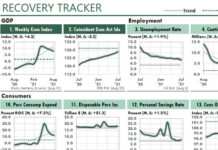
The Excel dashboard below is from the first-ever package of dashboard reports, which I created to show Excel's power to a client back then....
These example dashboards—prepared by an Excel-using employee—use charts and tables to show top-ten results for a medical device company.

Weekly & Monthly Top-Ten Activity Reports

0
When one of my readers, Chris Helfrecht, sent the two sample Excel dashboards below, he wrote that he tried to follow my methods for...
This Excel chart of High-Low-Open-Close stock data shows key methods you can use in charts...even those that have nothing to do with the stock market.

Using Excel XY (Scatter) Charts for Stock Analysis with HLOC Plots

0
One way to improve your abilities in Excel is to improve your understanding of the kinds of solutions Excel can generate when you use—or...

Latest Articles

Excel Flowbook Revolution

Getting Radical with Excel

It's time to think about Excel in a radical new way—when we use it to work with business or economic data. It's time, in fact,...
Growing too fast can be dangerous to your company's health. Use the Sustainable Growth Rate ratio to track your company's financial ability to grow.

How Fast Is Too Fast?

(Originally published in Inc Magazine.) What typically tops the list of worries of the chief executive officers of fast growing companies? Financing that growth, according...

How to Smooth Data by Using the TREND Function

0
Years ago, I read that Prof. William S. Cleveland had suggested that data could be smoothed by calculating a centered trendline through adjacent data—a...
Advertisement